NOEL TRIPLETT ZIEGLER
Experienced UX/UI Designer
Hyundai Capital of America: Site Redesign
Site redesign of three currently running OEM financial sites - Genesis, Hyundai and Kia.
Team
Requested By: Financial Service Institution
Original Product Concept Design: Noel Ziegler & Alice Wang & Clarence Bunch
Product Finalization and Build Prep: Noel Ziegler, Alice Wang, Lisa White & Clarence Bunch
Programs Utilized: Adobe XD, Zeplin
Content Written By: Latcha Content
Managed By: Blue Sky Studios
Project Ask
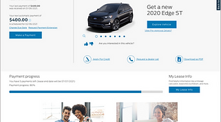
HCA came to Latcha + Associates in need of a site redesign for their financial site. Their main requests were to allow users to make a payment in 2 clicks and to decrease customer service calls. The current site also needed a visual overhaul that could extend to other branches of their corporation.
Idea: If customers are having to call customer service, then they are not finding the information the need. We explored research to discover the most common call reasons and we need to make those avenues more prominent and easily found. Another idea was greatly simplifying the payment process based on research of competitive sites.
Answer: We decided to greatly streamline the site and more match the Client’s Brand site so the customer is more familiar with the atmosphere. As well as making the most common call avenues more apparent, we also made sure every page on the site had an avenue to corresponding content to keep the customer’s journey moving. For the 2 click payment, we achieved that as well!
Research & Analysis


Work Flow: Phase One

Initial Different Ideas


Renders of Final Product


